New Philosopher Magazine:
Redesign from principles
For curious people looking for solutions to the fundamental issues faced by humankind.
New Philosopher magazine is an independent Australian publication that is devoted to exploring ideas on relevant modern issues. It caters to everyone from those new to philosophy, to academics.
I have been an avid reader of theirs since my university years, so I took the opportunity to redesign their website as part of my UI education. The magazine has taken great strides to make the traditionally guarded and academic topic of philosophy accessible and easy to read - but their website’s current state presents a usability hurdle for potential new readers and existing subscribers, and is a missed opportunity to promote their mission.
This case study is designed to demonstrate that an approach from experience principles alone can significantly improve a website’s usability and support the expression of a brand and their mission.
The project
Brief
Redesign a mid fidelity website or app experience of an existing brand, while maintaining the brand’s logo and colour pallet.
My redesign is for the New Philosopher magazine’s website, including landing page and one edition page. The redesign focused on elements including:
- Layout and visual hierarchy
- Content design and CVP prominence
- Information architecture: Navigation and user actions.
Problem space
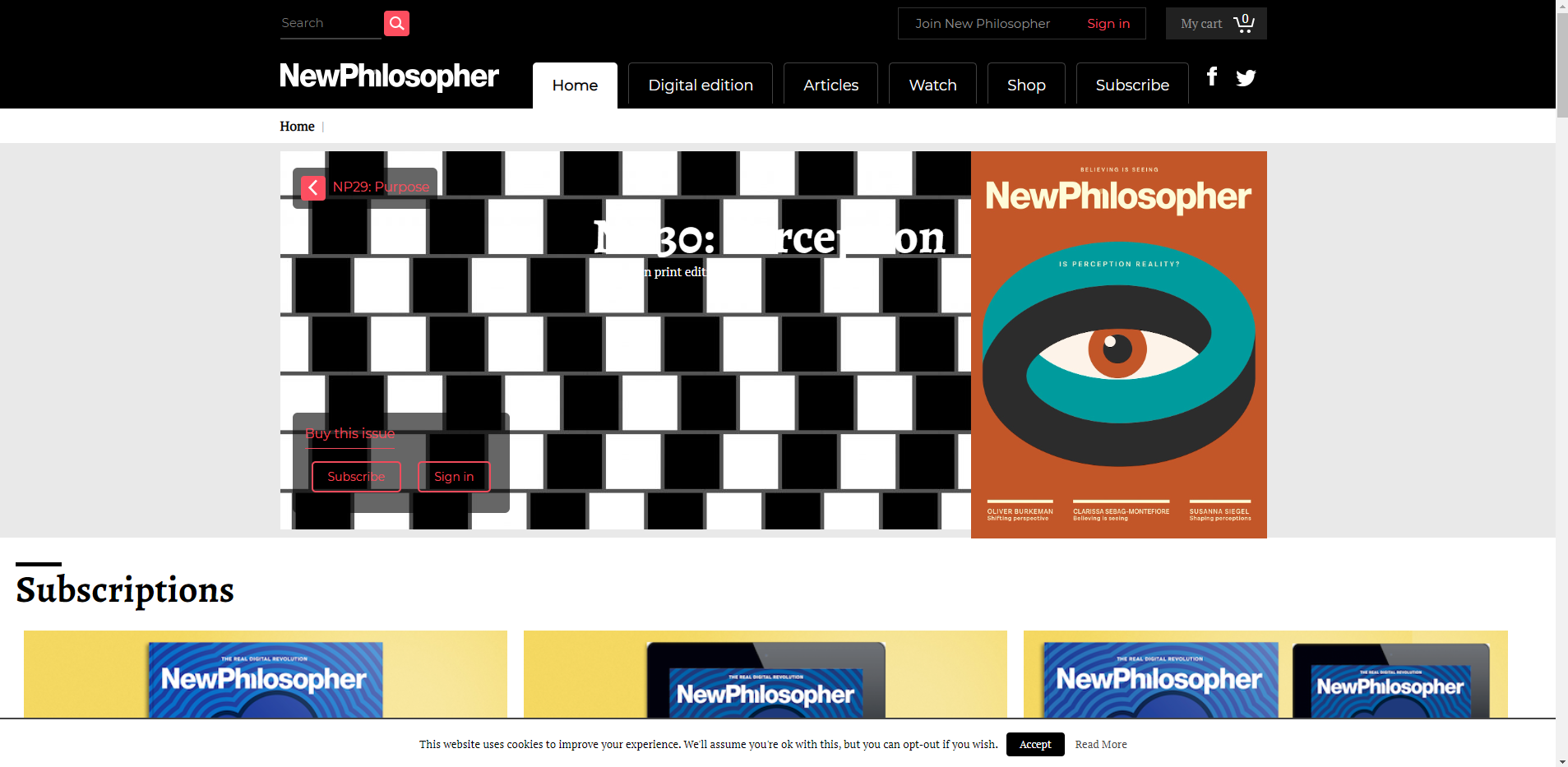
The existing website displays a need for uplifting their digital experience:
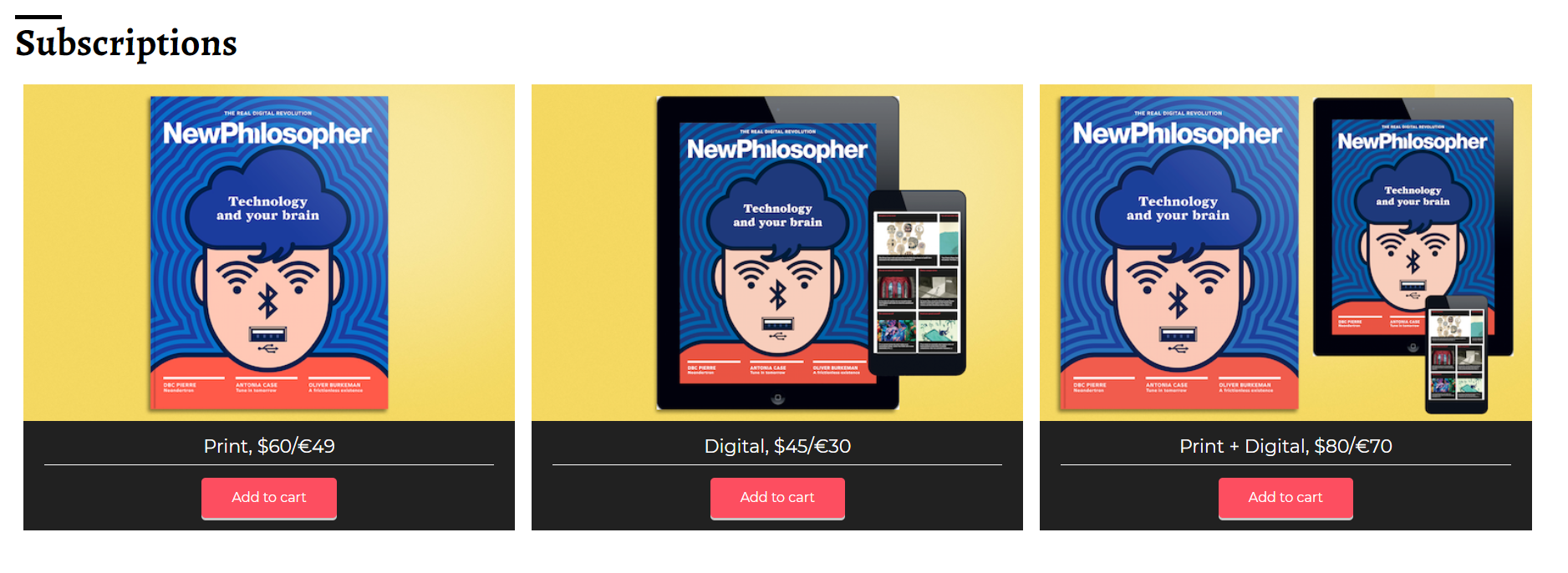
- The current design has an immediate and overwhelming focus on conversion, by highlighting their subscription services early on their home page
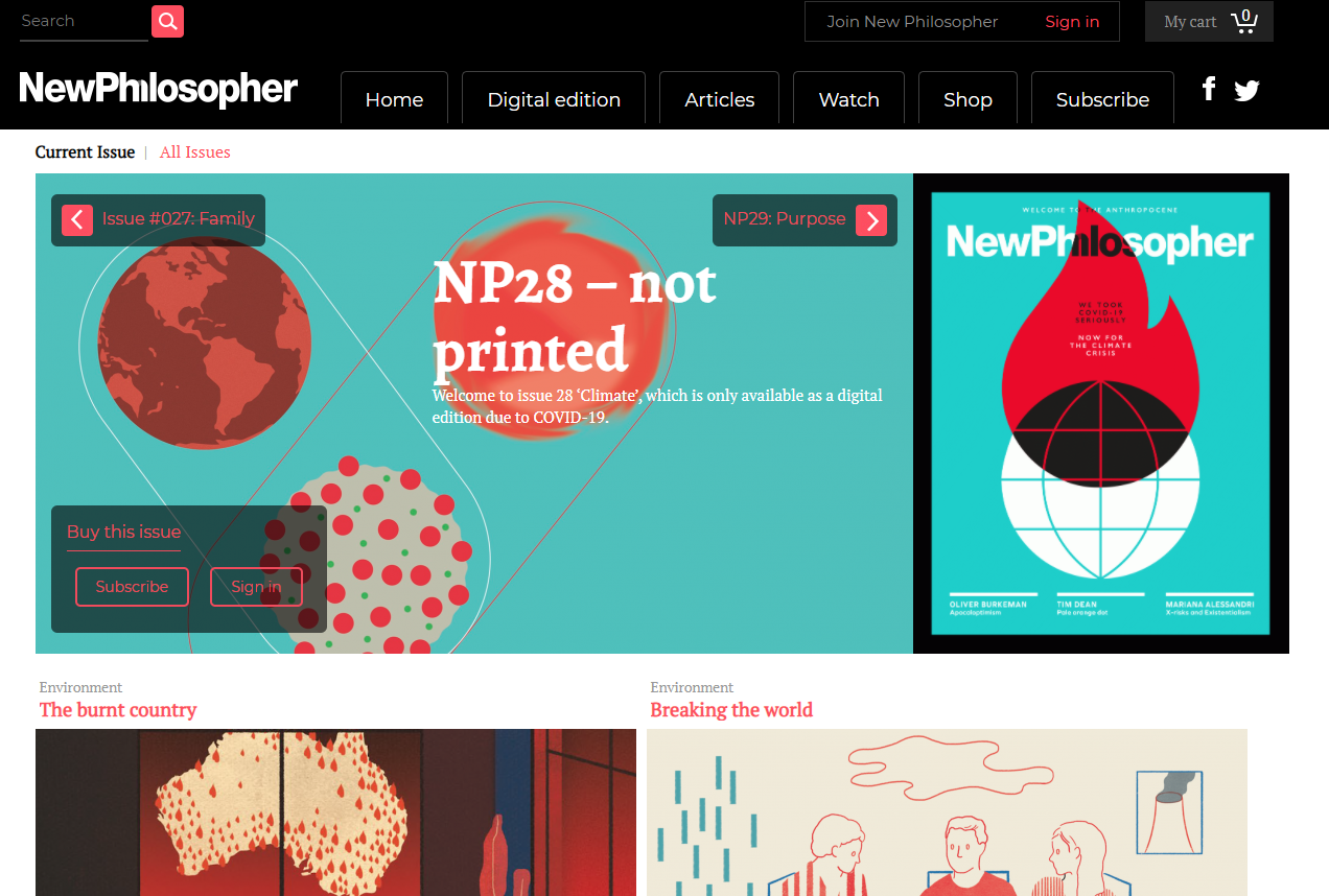
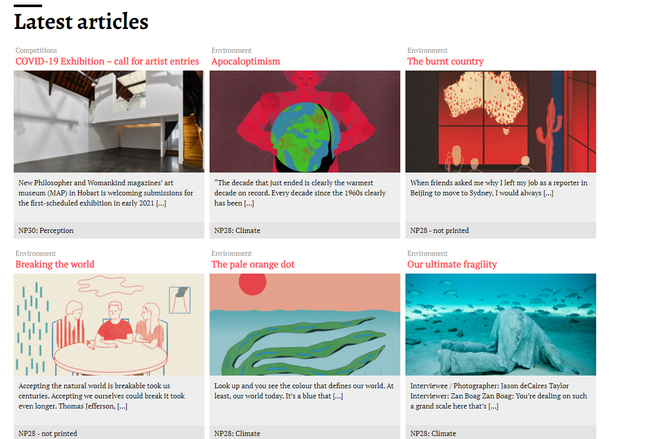
- Images and content are out of alignment from any grid that may exist
- On the home page navigation, search and the navigation menu pages do not meet web conventions, and this is exacerbated through varying terminology for their services across their pages
- The magazine’s mission is hard to find, as the carousel copy is always white, meaning some text about the magazine is unreadable posing an accessibility issue.
Opportunity space
There is a high likelihood that customers are not having the best digital experience and are probably leaving the site without understanding New Philosopher’s mission, or having trouble finding what they need.
As the brief did not allow for user research, I kept my customer hat on while designing, so that the readers of this new website can navigate and understand the magazine mission with ease.
Experience principles
Bring my digital experience up to conventional standards
I created a six-column grid system across all redesigned pages, where:
- A ‘see more’ CTA has allowed the page content to be stacked to reduce scrolling effort and user cognitive load
- Page divisions and headers aligned to the left, elevated from the existing website branding
- Where content is divided horizontally, CTAs and images are aligned to the furthermost columns to fit within the grid layout.
Highlight the mission & value to me as a reader
Content design by highlighting the magazine’s message was the biggest uplift in this redesign. I wanted to reflect the CVP communicated on the issues higher on the website hierarchy to facilitate a meaningful and consistent message:
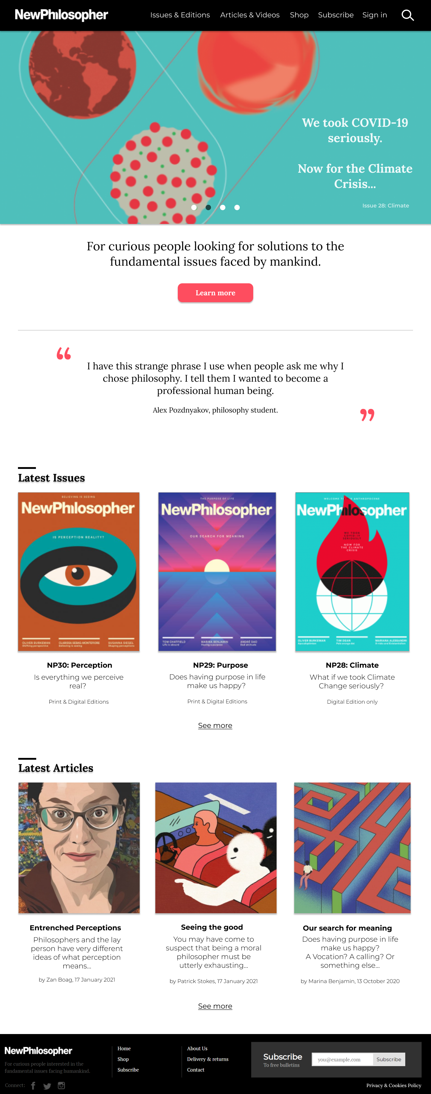
- The magazine’s brand phrase is highlighted immediately in large text, alongside reader testimonials
- Each article and issue description label has been reworded to better represent its content and encourage interest from the reader
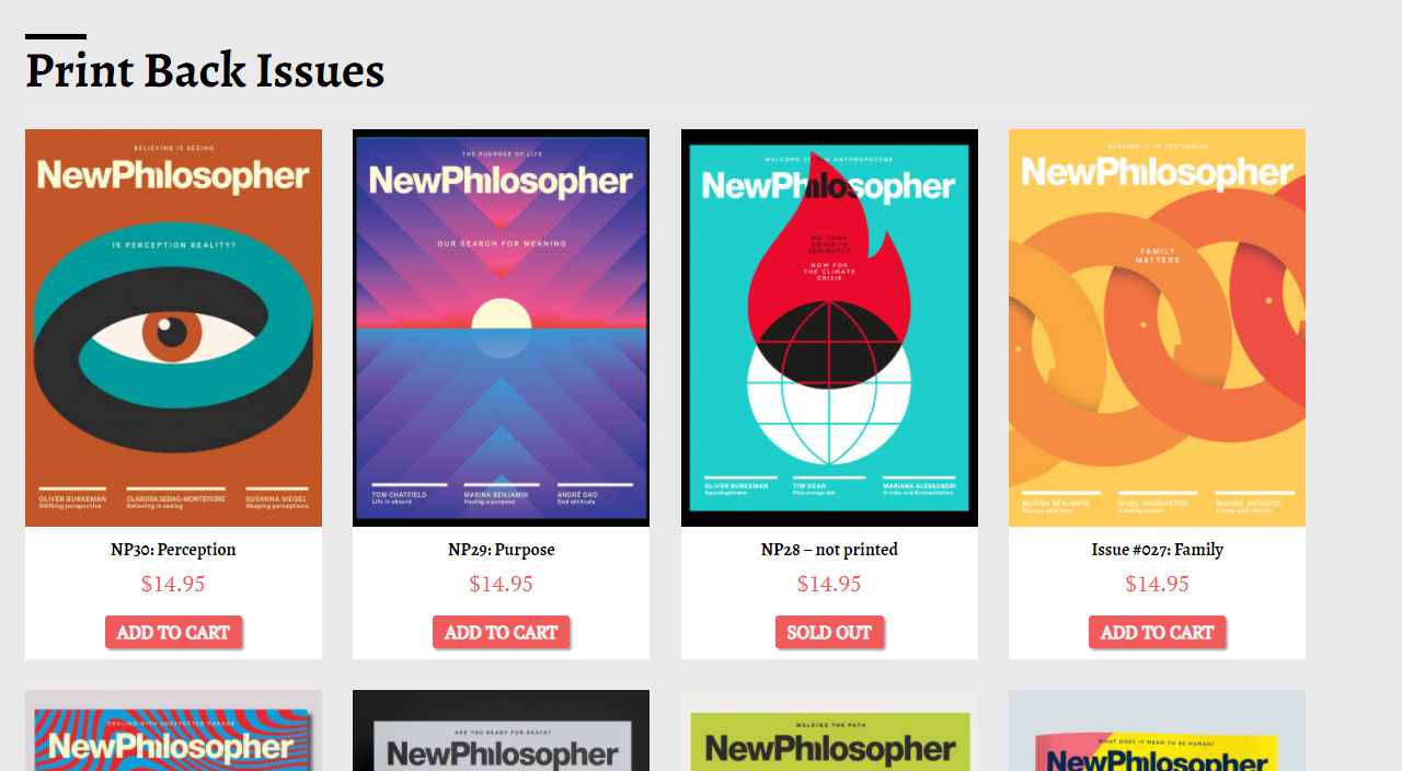
- Instead of dividing home page content by Print or Digital editions, each issue has their own dedicated page, and the home page - content more meaningful in newsletter
Make the things I need easy to find
When getting familiar with the current site, its navigation and page labelling proved for a confusing experience. To bring this website closer to ideal web conventions and accessibility standards, I have:
- Relabelled and grouped the navigation options for a more meaningful and naturally categorised page structure
- Moved the search function to the top right, as per modern website conventions
- Structured all navigations into a single grid line, as opposed to the initial three, and have removed additional entry points and CTAs (like the Join, cart and social media sharing functions)
- Structured the breadcrumbs as an extension of the Nav bar using the same black, and relabelled the breadcrumbs to ensure they match the correct IA page structure
The redesign
Home page (left) and Current issue page (right)
Issue 30 Home page and current issue redesign.
Next steps would include validating the CVP and usability in research, and potentially using this to encourage New Philosopher editors to reconsider their current website design.
